
A great season is on the cards for Barça following the arrival of two world-class strikers, Agüero and Depay. Fans are excited about the arrival of these new players, but slightly less so about the jersey they will be wearing. Many have appreciated Barcelona’s new design, but many others have been left disappointed.

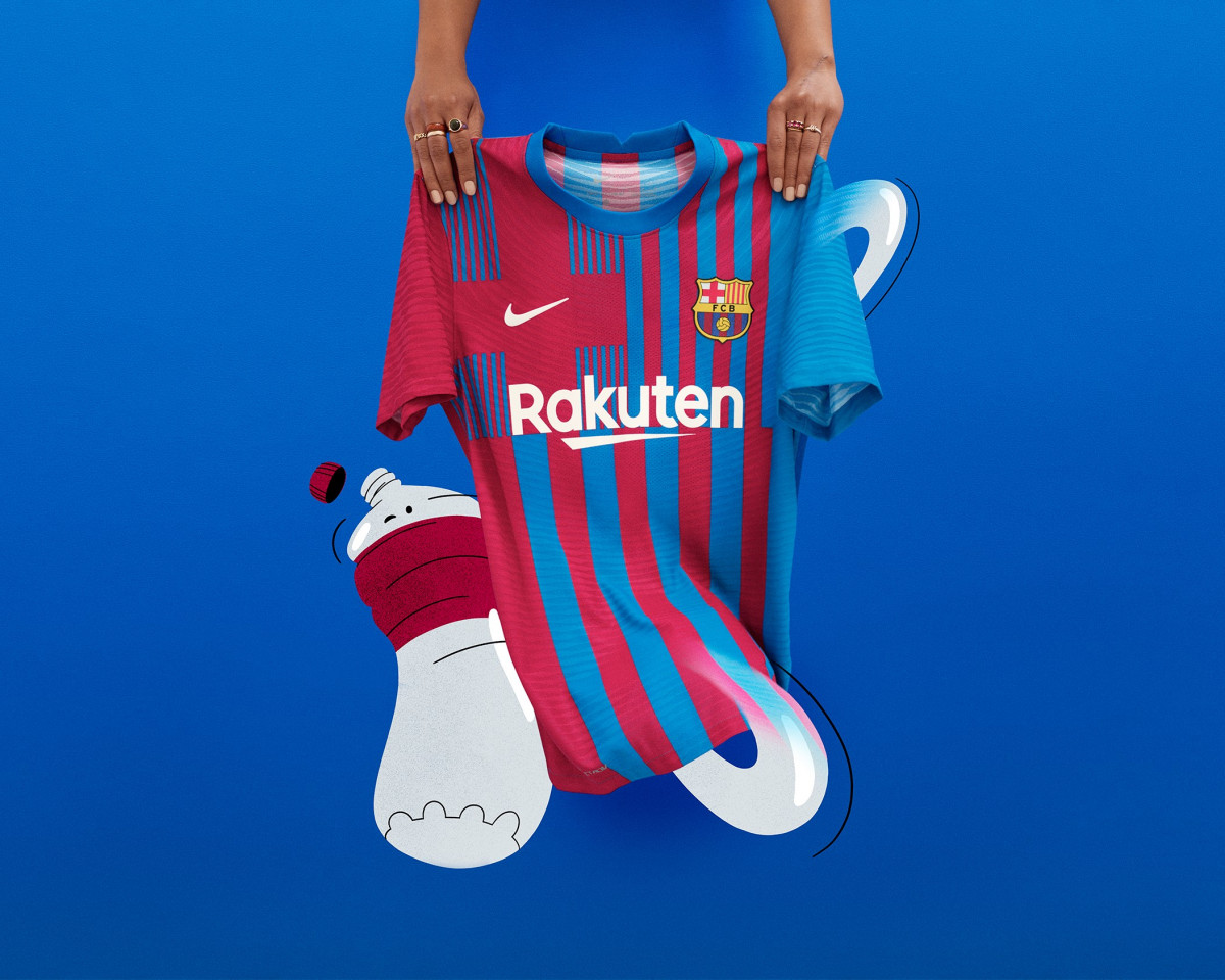
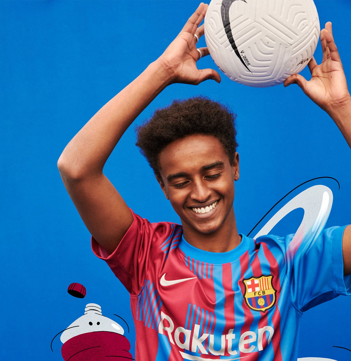
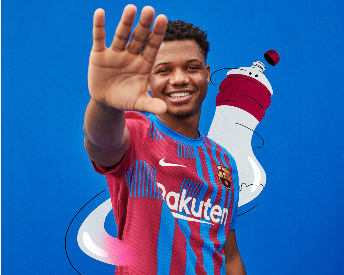
The Blaugrana’s new kit has sparked a lot of debate. Fans are divided: some love the new concept that Nike has created for the Catalan team, whilst many others have claimed it is one of the ugliest shirts of recent years. But why all this? Why has Barcelona’s new kit been met with such a negative reaction? Well, it is probably because the change from the previous jersey is so drastic; both the colour tones and the design have been significantly altered.

This year, Nike has taken inspiration from the club’s crest; in fact, if you look closely at the design, it’s practically identical, particularly the lines that make up the jersey. In the top right-hand corner, there are some very small, fine lines next to the maroon cross. In the top left-hand corner, however, there are thicker lines that alternate between a blue verging on lilac and the familiar red we’ve seen before. Finally, beneath the team sponsor’s logo, we see parallel lines once again that alternate between these two colours.

We’ll round off this post with the shorts: one side is entirely blue and the other entirely red, with a rather bold design that will go perfectly with the Blaugrana’s home jersey. What do you think of the Barça kit? Do you like it? Feel free to share your thoughts in the comments section below,


Log in or
create your account
Your best self starts here. Come in and get in your prime