
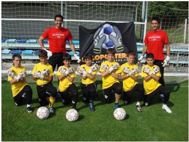
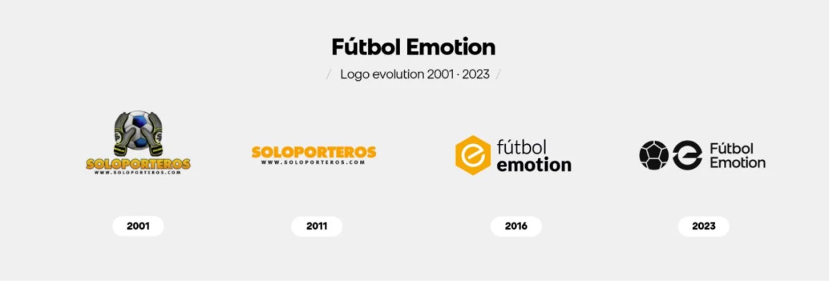
In 2001, our company was founded by Javier Sánchez Broto under the name SOLOPORTEROS. During his career as a professional goalkeeper, he identified an unattended niche: goalkeepers. Initially, the shop sold only goalkeeping products, with gloves being the main item, which is why they feature in the logo design. The SP brand, designed by the Soloporteros team, can be seen within the design. This brand continues to be a benchmark in the sector today. Another notable development was the launch of the website. It is important to remember that, in 2001, e-commerce was still in its infancy, and Soloporteros was one of the first companies to sell products online.
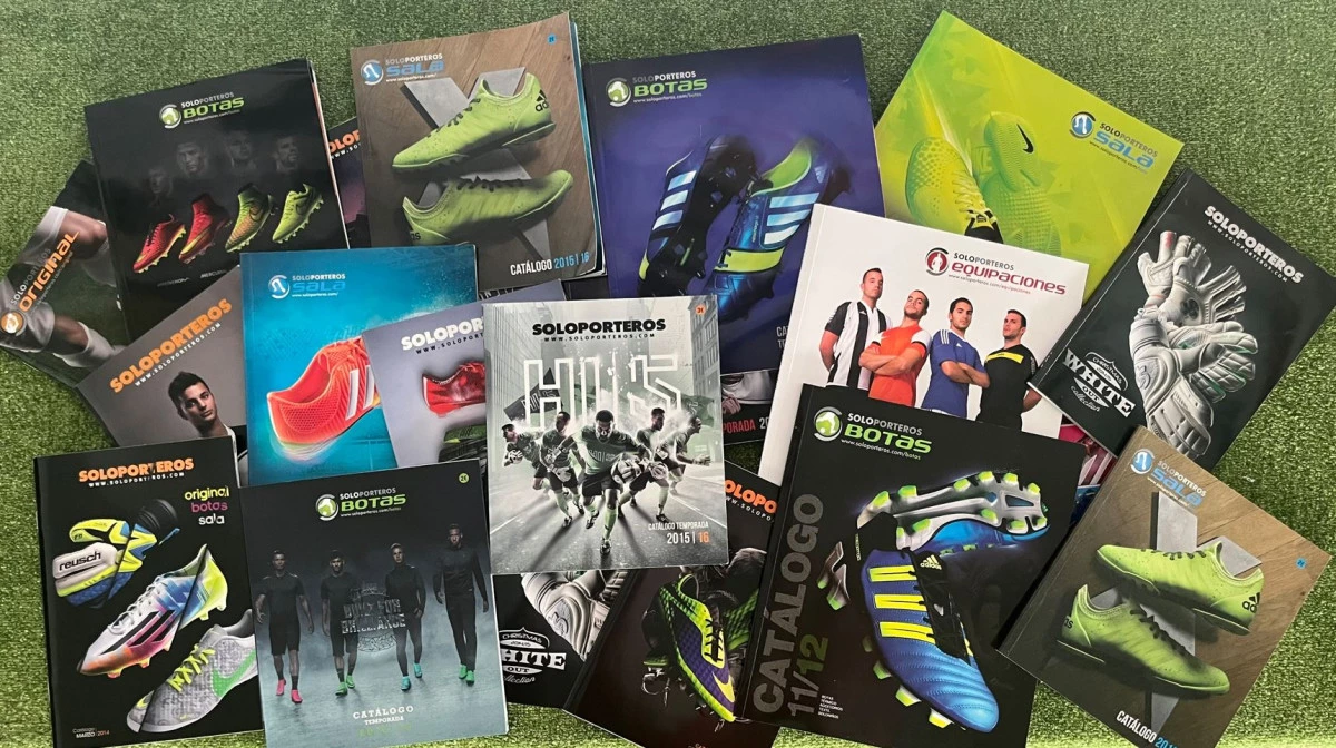
In 2011, the logo underwent its first redesign. Ten years had passed since the company was founded. Although it still struggled to create experiences, the company had made its way into all football teams thanks to its goalkeepers, and its products had become more specialised and globalised. Many will still remember the famous Soloporteros catalogues arriving in their changing rooms at the start of the season. This redesign saw the gloves removed, the typography stylised and the brand's signature orange colour given more prominence.
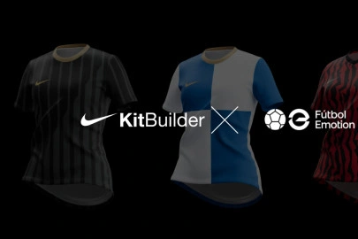
In 2016, a major change took place, which came as a shock to many of our customers... we were no longer Soloporteros! We continued to grow, and the world of goalkeeping had been joined by players, futsal, fans, clubs, and our international expansion was beginning. We wanted a more global name, but we wanted to maintain our origins as a Spanish company. Fútbol Emotion was the name chosen, and with it, we created a hexagon with the letter ‘e’ that expressed our e-commerce vocation and our new slogan, emotion.
In June 2023, exactly seven years after we changed our name, we decided it was time for a redesign to mark the new era that the company is entering. We will gradually reveal this redesign to you. The logo features the ‘ball’ and ‘e’ icons that represent our name in a contemporary black-and-white style. Alongside the logo, we have designed a new font called 'Be the Best', our new corporate slogan that encapsulates our ambition and belief in being the best product specialists.
We know that change can sometimes be difficult, but we hope you like our new look. We're still the same company, just with a fresh new image, and we hope you'll continue to support us for many years to come.
Log in or
create your account
Your best self starts here. Come in and get in your prime