
Having looked at Inter’s kit, today it’s time to analyse the kit of Milan’s other team, Donnarumma’s AC Milan, who – following the break due to the lockdown – are having a great season, earning the respect of every team they face and ensuring, almost certainly, that Pioli will also sign on for next season. But let’s move on to what interests us most: the new kit they’ll be wearing next season. As you can see, it’s a fairly classic design that doesn’t rely too heavily on bold prints or extravagant designs.
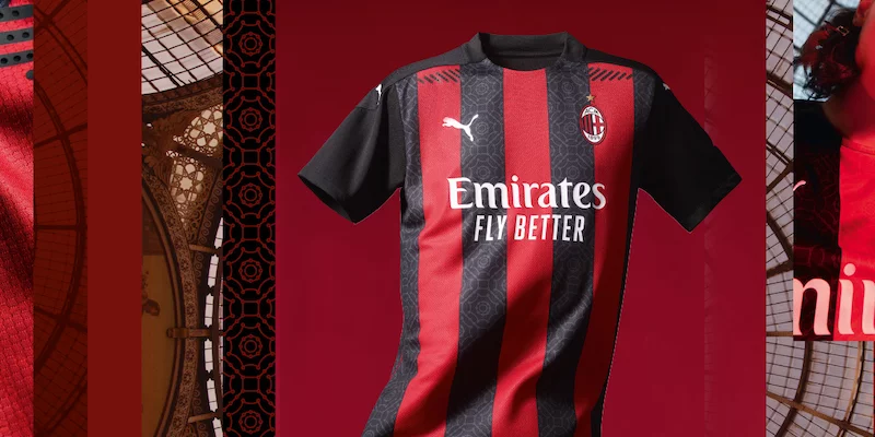
As you can see, Puma hasn’t wanted to take too many risks with a modern or bold jersey, but has instead sought to create an iconic jersey that represents the city, the club’s history and all its fans. That is precisely the message that Puma and Milan have wanted to convey to us: a jersey that tells a story and embodies a part of the city. In this case, the jersey is inspired by one of Milan’s most famous landmarks, the Galleria Vittorio Emanuele II, Italy’s oldest shopping centre.

It seems clear that the colours are the classic ones. In fact, we see a very intense red and a black that contrasts perfectly with that bright red. As usual, there are vertical stripes alternating between these two colours, but as a special detail, the black stripes feature a small design that depicts the gallery’s architecture.
Finally, there are white details such as the Puma logo. We’ll see this jersey for the first time on the 2nd of August, at San Siro against Cagliari, in the final match of this rather strange season.


Log in or
create your account
Your best self starts here. Come in and get in your prime