
New Tottenham kit
Tottenham’s new away kit is a celebration of the unity, diversity and cultural creativity found in North London; to this end, the designers have opted for a blend of colours, as if working on a canvas. This colour palette is based on black, against which various shades of blue, yellow and other colours are rendered, giving the shirt its bold and eye-catching look.

The sponsors’ logos and names stand out in a striking shade of yellow, and the truth is that once you see the shirt on the pitch, it really comes to life, and you can really see that sense of cultural unity we have in the British capital.

In terms of design, to be honest, there’s not much more we can say that you can’t already see in the pictures; this is one of those jerseys that you either love or hate, as the look might be a bit much for some fans. However, we can say that it certainly looks good on the pitch, and we’re grateful to the designers for adopting this sort of design for the official jerseys. Designs and concepts that, until very recently, we could only see in video games.

From a technical standpoint, as is customary for the American brand and in line with its bold and direct approach under the slogan “Move to zero”, it uses 100% recycled polyester, which speaks volumes about Nike’s genuine commitment to protecting the environment.

The key technology is the new DRI-FIT-ADV, a technology designed to wick away sweat and keep us cool and dry at all times. Combined with the new fabric, this technology ensures that the shirt remains lightweight even as the minutes tick by, whilst offering a fit and feel that hugs the body like a second skin. Of course, there will be a fan version with a more regular fit, which will also be perfect for many Spurs fans.
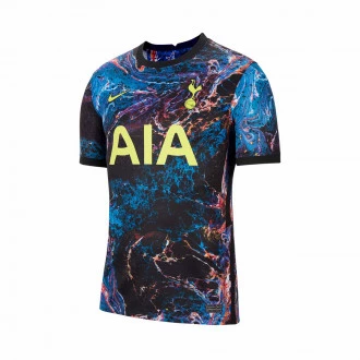
And here’s Tottenham’s new away jersey – a truly wild design that’s sure to turn heads. We’ll see how they get on in the league this year. Now available on the Fútbol Emotion website.


Log in or
create your account
Your best self starts here. Come in and get in your prime