
The 31st of October is now a national holiday when all kids (and not just them) dress up to go trick-or-treating at their neighbours’ houses. This year we’ll see lots of different costumes, but most will pay homage to the Squid Game, which was a real global hit. However, if you want to stand out from the crowd, today we’re offering you 5 football jerseys options that could certainly serve as costumes to give people a fright.
2016/17 Deportivo Palencia
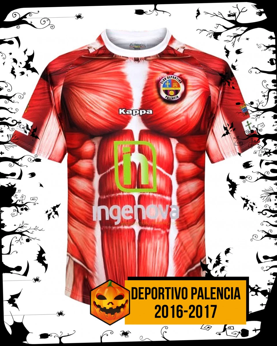
Deportivo Palencia, a Spanish football club from the autonomous community of Castile and León, will be remembered forever for its kit from the 2016/17 season. During that season, the club opted for a rather daring and somewhat nonsensical design. The Palencia players took to the pitch in a kit featuring a design of the human body. Yes, you read that right: the human body. The jersey and shorts were printed with a pattern representing muscles and their tissues. The creator of this surprising work of art was Kappa, an Italian company that ensured both it and the Spanish club became the talk of the town.
2020/21 Inter Milano
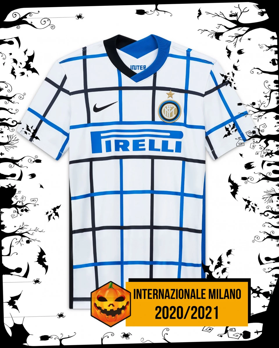
It’s certainly not one of the ugliest, but it’s not among the prettiest either. Inter Milan’s away kit for the 21/22 season was one of the most widely criticised in recent years. Shortly after its unveiling, social media became a real nightmare for the Nerazzurri and for Nike, as countless memes mocked the kit. Some thought it could be used to play noughts and crosses, others thought it was a picnic blanket for the park. The fact is that the Milan team’s fans were furious and disappointed.
2016/17 Club Deportivo Guijuelo
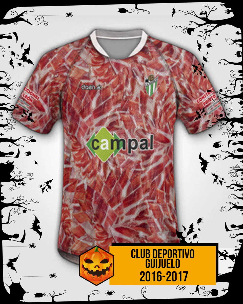
Paying tribute to one’s own traditions and origins has long been a popular approach to conceptualising and designing the style of a football jersey, but when food is the main tourist attraction, what can you do? Club Deportivo Guijuelo, a team from a small village near Salamanca, didn’t overthink it and simply incorporated a pattern of strips of ham – a product produced by 65% of the village’s inhabitants and famous throughout Spain as ‘Guijuelo ham’.
2014/15 Napoli
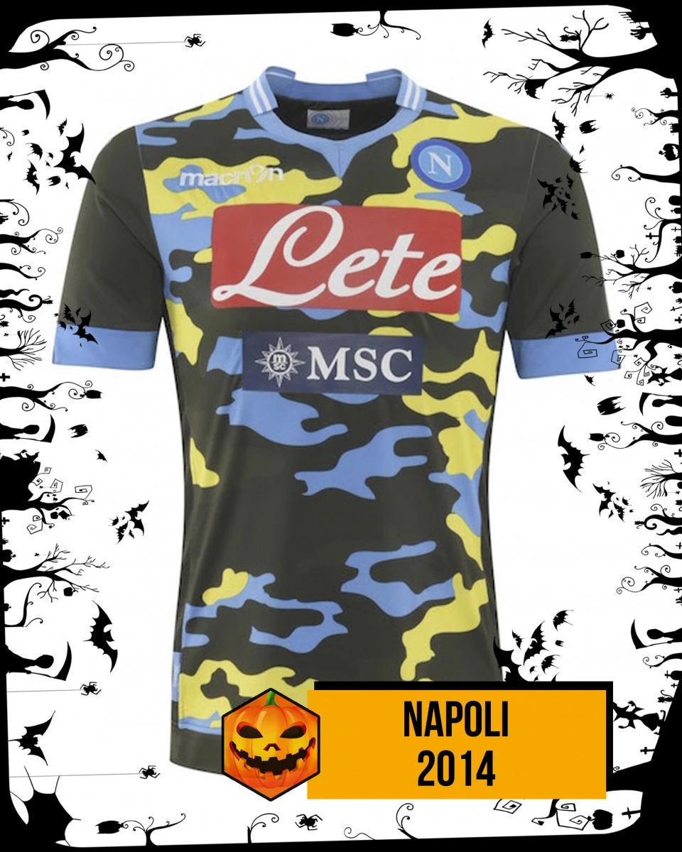
Another Italian team that we unfortunately come across on this post. This time it’s the turn of the Neapolitans, who in 2014 decided, in collaboration with Macron, to launch a jersey featuring a military motif. The idea wasn’t a bad one, but not for a football jersey, and certainly not with those colours. The shades chosen for the Neapolitan kit were yellow, military green and a touch of blue that clashed completely. It was a productive season for Benítez’s lads, but the jersey design wasn’t the best.
2014/15 La Hoya Lorca
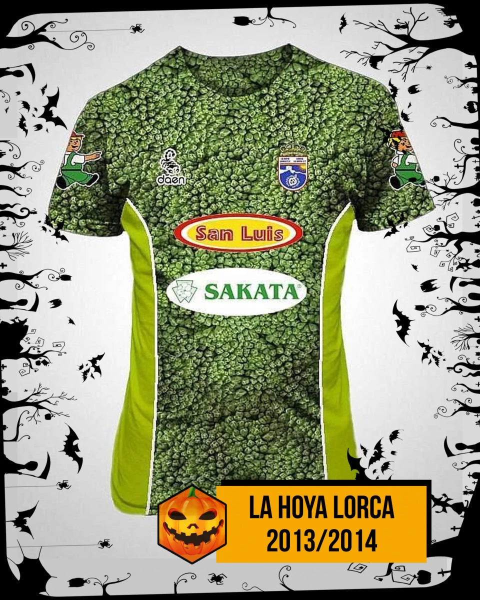
We finish with another Spanish club that doesn’t have much of an eye for design. This time it’s the turn of broccoli, the real stars of the jersey. The small team from Murcia chose to wear a jersey featuring vegetables on it, specifically broccoli, a vegetable grown in abundance in that part of Spain which, after becoming the star of Lorca’s jersey, also gave the team its nickname; from that year onwards, they became known as the ‘Mechanical Broccolis’.

Log in or
create your account
Your best self starts here. Come in and get in your prime